my approach to color

How do I choose colors?

How do I decide what colors to put together in my quilts or other work (paintings, outfits, collages)?

I get these questions all the time.

It is hard to answer these questions to answer in a concise way, in a quippy short caption on social media.

First of all, I love all the colors of the rainbow/colorwheel, in all their shades and tones and intensities.  Really.  All of them.  They are part of my palette, a seemingly infinite array of toys to play with in my art.

I love to “play with color”, observing how colors interact with one another visually.

When it comes to fabric, colors typically interact by sitting side by side or in concert with other colors in a grouping.  When constructing a quilt, or perhaps a textile collage, I start by pairing two colors or pieces of fabric and seeing if I like the conversation they are having with one another from a color perspective, taking into account matters of intensity/saturation, value, and relationship on the color wheel.  I don’t reference an actual physical color wheel anymore, I have mentally conceptualized where colors sit in that framework and I more than often just let my eye/brain and intuition/emotions guide me toward a pairing that feels “right”.  What’s “right” is what’s “right” to ME, as color is personal and subjective to the maker and the observer.

If I am painting fabric or just painting in general, there are different considerations at play because paint can be transparent or opaque, and if the paint is transparent, colors are able to interact with one another and with any color of fabric or paper that is used as a ground.  Some really interesting colors and pairings start to emerge in the layering of these colors.  Transparent paints seem to sink into the surface and into one another and the opaque paints sit on the surface.  Using the different opacities together on one piece of fabric together can be really exciting and I often love playing with them both.

I very much like color pairings that give me a visual jolt, a little brain buzz, something that makes me slightly uncomfortable or that makes the hairs on the back of my neck stand at attention.  Maybe that’s dopamine?  Whatever it is, I live for that jolt, that relationship between colors that gives me a physical reaction.

Yes, this often means using saturated color.  But I am also acutely aware that variety is good, so I work on building variety in quilts with variations in color, as well as giving a lot of attention to giving my quilts depth with variations in value.  Lights and darks.  The light values advance and the dark values recede, giving the surface a feeling where some sections drop out while others almost glow.  I don’t like a sense of flatness in my quilts, it gives me a visceral feeling of deadness and I try to avoid it.

Most of my quilts/work is very simple in construction, leaning heavily on repeated blocks and shapes that are probably pretty “traditional” in nature.  I.e., simple blocks like log cabins where I can vary the colors in every center, log, or round, and see how the colors interact as the block builds out from the first pairing, and how all the colors work together as the block or piece increases in size.  Then when I am putting all the blocks together I consider where to place each block in relation to all the other blocks, trying to avoid the same colors touching anywhere or clumping of colors and similar looking blocks.  I’m trying to create a field of color.  All this to say, there’s a method to the relative madness.

I choose colors for my pieces in an improvisational way.  I make the decisions in the moment and I don’t ever plan out a quilt beforehand, except to land on what block or shape I want to work with from the jump.  Sometimes even that changes as I proceed.

Some of the quilts or other work I make do focus tightly on a particular colorway.  This might be a time when I think more directly about relationships on the colorwheel, choosing colors that are perhaps analogous for visual variety and continuity but also thinking about a color that’s complimentary or even a little clashing, to add in that sense of unease, to give that jolting feeling.

I also definitely have certain pairings I get stuck on/obsessed with for long periods of time and colors I tend to use more than others.  For quite a while I was obsessed with electric blue and pink, which I often paired with reds and purples.  Those are all analogous.  I often use a lot of green for reasons I cannot quite discern.  I like pairing colors with black and/or white as well.  Again, contrast.  A sense of grounding, but also a graphic quality.

Neons are a lot of fun, it’s the jolt factor turned up to 11.  Best used sparingly but it’s also fun to go overboard sometimes, too, because why not?


Advice? I definitely have some.

Honestly, I like doing what I’m advised not to do, just to see what happens.  Going overboard with color or fabric is pretty safe, compared with say, jumping off a cliff without a parachute.  It’s just color.  It’s just fabric.  There’s everything to gain and nothing to lose when you experiment with color and fabric.  JUST DO IT.

In teaching, learning, and working and talking with others and observing my own growth over time, I have come to the conclusion that working with color or being comfortable with working with color is a learned skill, and more often than not, it can feel hard when we get in our own way and overthink our choices, when we become paralyzed by choice or paralyzed by what we think others might think.  Or when we are overly influenced by what society or trends dictate.

None of that shit really matters.

Confidence matters.  What your heart and guts say matter.  Get out of your own way and take chances and make choices and stand by them.  Be wiling to try and be willing to make “mistakes”.  Be open to experimentation, to trying and seeing what happens.

At some point, a deftness with color clicks in, and it’s a shift that often happens gradually, without fanfare.  The understanding is internalized and isn’t a struggle.  You learn to trust yourself and your choices.


How do you approach color in your own work?

rope dope dope rope

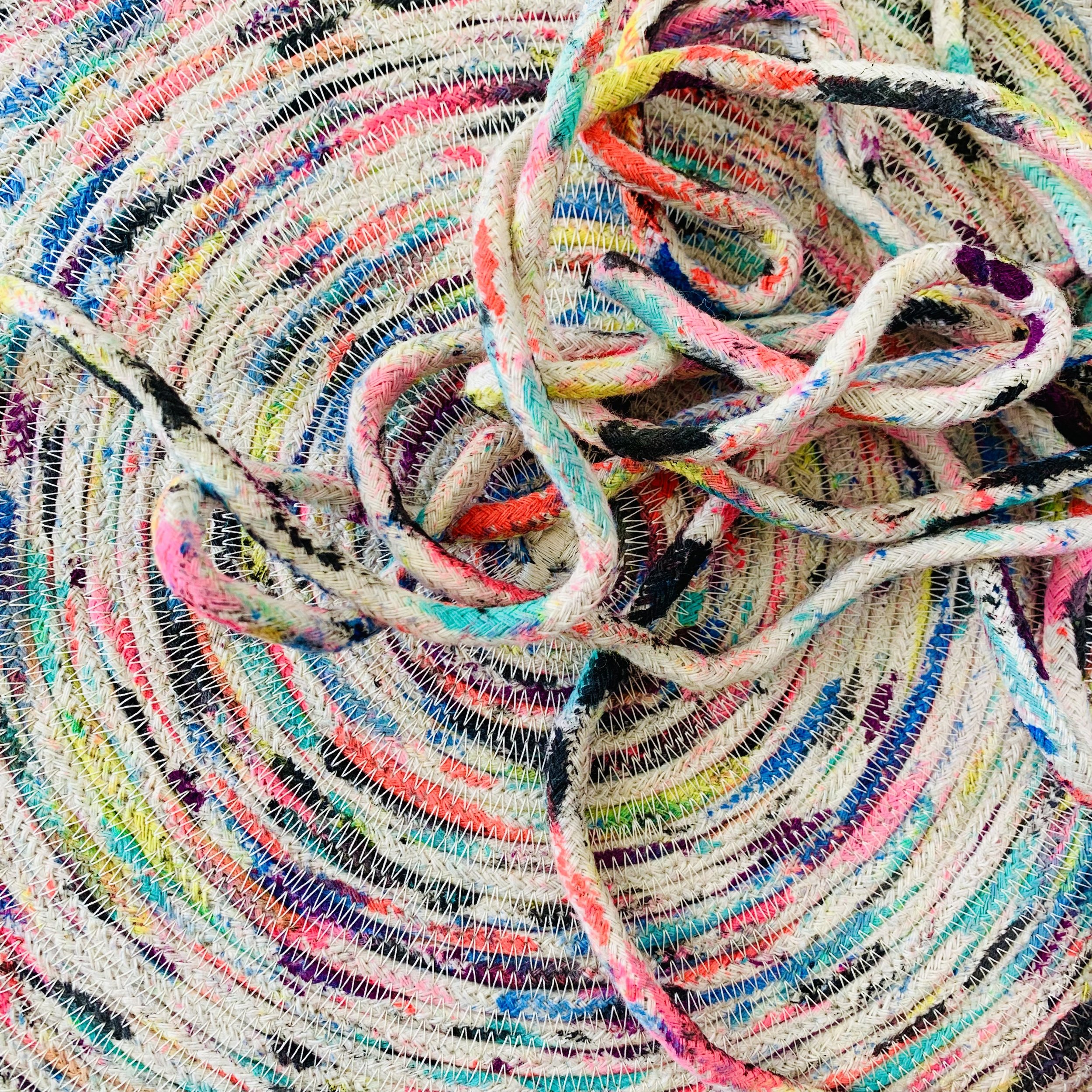
I have a little practice of making rope vessels and mats.

i enjoy playing around with the possibilities…mixing in those fabric and yarn scraps that I just can’t seem to throw away, or painting the rope in an organic way (with random daubs of paint), etc. I also like using different color threads that contrast or compliment the color or colors I have used to paint the rope.

my overall approach is to explore and feel around and sense the edges of what’s possible, make the same object over and over and work through the iterations of the idea. this goes for these rope vessels, but also is indicative of pretty much anything I do: the clothing I make, my quilts, collages, etc.

scrap hoarders anonymous

for as long as I can remember…I have:

  • had major issues throwing away any useful scrap of fabric and/or yarn

  • had a sick obsession with piles of scraps, especially little piles of yarn trimmed off of knitting or crochet projects, or the minuscule shreds of fabric that are cut off of bits of patchwork in the making of a quilt.

this has led to collecting, err, HOARDING large buckets and boxes full of said tiny scraps. there’s just something so delicious about these little bits!

I have been trying to get to the bottom of why they delight me so much, and I have a few theories knocking around in my mind:

  • they remind me of multicolored paper confetti, or the sprinkles that decorate ice cream, cake, or cookies

  • they remind me of childhood, of innocence

  • I like looking at fields of color, and observing the interplay of the colors in the field. in fact, many of my quilts from recent years have this same feel/aesthetic. ALL THE COLORS, ALL THE TIME.

  • the textural quality of the yarn or fabric is also part of the equation as well, it’s as flat as paper can be (though I love paper confetti as well!); the weave or the fiber adds another element of interest. even the fraying at the edges can be interesting to look at

do you collect or save scraps?

of fabric, yarn, or anything else?

what do you like to do with your scraps? how do you utilize them in your art/or craft practice?

why do you like saving or working with scraps or using them?

black and white hand-painted quilt coat


seen here:

a hand-painted quilted coat I made in the summer of 2021.

the pattern is the Gibson Coat by it’s all in the stitch. I like this pattern because it’s got an oversized fit, and kimono-esque sleeves with a lot of ease through the armhole area. it’s perfect for layering; I like to wear mine over sweaters and sweatshirts in the cooler months.

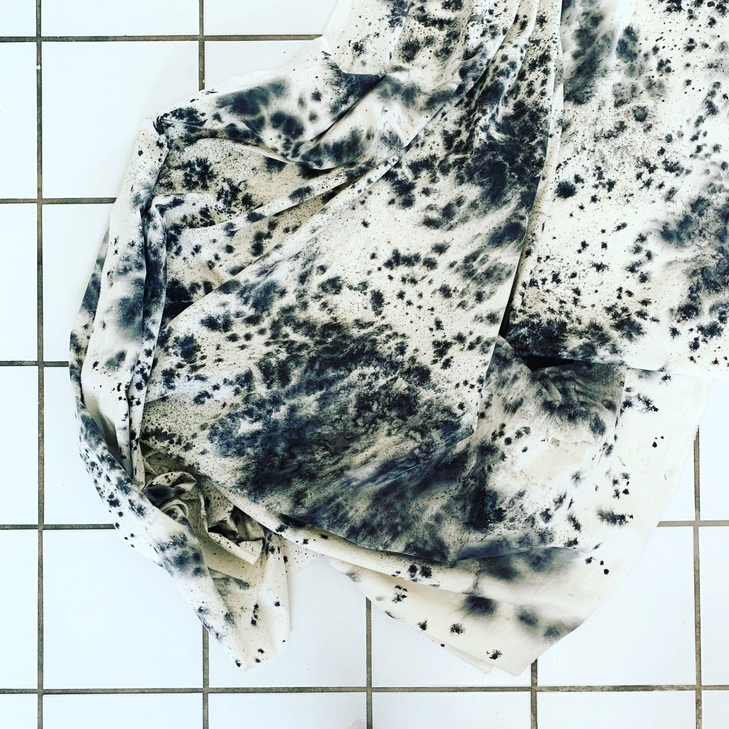
my first step in making this coat was to hand paint the fabric, seen below. I used black Dye-Na-Flow fabric paint (sourced from Dharma Trading Company, in Petaluma, CA) on about 3-4 yards of Kona Natural. The process was basically to apply the black paint to the surface of what was initially dry fabric (laid flat on my worktable over a tarp), using a plastic eye dropper tool. after applying the paint, I used a spray bottle filled with water to partially wet the fabric and force the paint to bleed and flow in an organic pattern. the bleeding happens in an unpredictable way, and happens before your eyes; it’s pretty delightful to watch.

I then let the fabric air dry, draping it over some drying racks to ensure good circulation of air around the yardage as it dried.

I should note, at the time I was working out of home garage, a place where I do most of my painting and wet processes like dyeing. I am not living in my house anymore (my house is under renovation); I miss being able to mess around with paint, fabric printing, and fabric dyeing! but I digress…

once the fabric had air dried for a day or so, I brought the yardage inside, and put it into the dryer for 1 hour, on high, to heat set the Dye-Na-Flow paint and further bond it to the surface of the fabric.

the next step was to quilt the fabric. I used my Janome 6700 and a walking foot to quilt the fabric, in a diagonal crosshatch design. the quilting lines were approximately 2” apart, and I used a coordinating white thread to quilt all of the pieces of the coat. the inside of the coat is plain Kona Natural; it was not altered or painted in any way.

once all the pieces were quilted, I got down to the construction of the coat. I chose to make all the seams bound and visible, intending to put the bindings on the outside for a bolder look, as if each seam was visually outlined.

the making of the binding is notable: I wanted black binding but couldn’t find a solid black fabric that felt like it matched the black tone of the paint that I used, so I got creative and painted about a half yard of Kona Natural with black Dye-Na-Flow, basically dyeing the binding to match the rest of the coat.

i’m very pleased with how this coat came out. it’s a truly perfect layering piece for LA’s mild weather and unique; I have gotten many compliments on it when I have worn it to classes at school this past year.

interesting links: june 8 2021

the links sharing with you this week deal with textile production/manufacturing, and/or consumption; all subjects that have interested me for decades. if you’re into textiles, textile arts, or clothes making, perhaps pieces like these may interest you as well.

xoxo, tricia

  • robert evans, of the behind the bastards (podcast) recently did an episode on the triangle shirtwaist factory fire, an industrial accident that occurred in nyc in 1911 (one hundred years ago this year!) that killed 123 women and 23 men, many of whom were jewish and italian immigrants. more on the triangle factory fire and how it subsequently affected labor laws/standards here.

  • here’s a NYT review of a new book titled unraveled by maxine bedat that explores the darker side of the garment industry by following the life cycle of a pair of jeans from beginning to end. the answers, according to reviewer vanessa friedman, aren’t pretty. i’ve downloaded an audiobook version of the book; perhaps i’ll check back in at a later date with my thoughts after listening/reading. an excerpt from beats book is on fast company, titled see the horrifying place where your clothes go to die, in which the author explores a smoldering garbage dump in ghana where many cheap fast fashion clothes are ultimately discarded.

  • ‘I felt nauseous in Topshop’: why a fashion editor gave up buying new clothes by Morwenna Ferrier in the guardian (uk). have you given up buying new clothes? i used to thrift and buy a lot of clothing secondhand and still feel strongly about purchasing things used but i thrift shop a lot less than i used to. i am hoping to change that habit as the pandemic wanes and i am able to get out there more to shop and browse.

starting fresh.

hello and welcome!

i’ve decided to redefine my social media presence and return to blogging after a long hiatus.

i will be sharing little windows my world: a look into my art and my process and what inspires me, as well as peeks into my private life.

i will also be regularly sharing links to items (news and otherwise) i have stumbled across that intersect with my interests: textile art, surface design, fashion and clothing, interiors, as well as news relating to current events that i find compelling and/or thought-provoking.