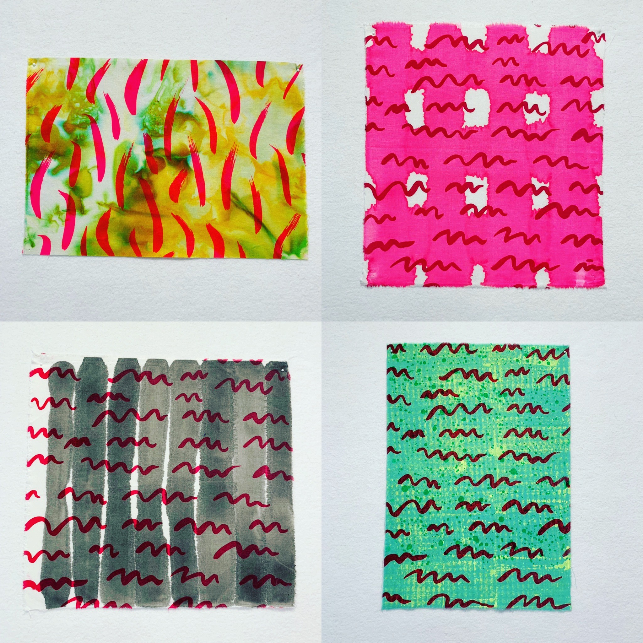
#52weeksofsurfacedesignweek 7: dyenaflow drips and swipes, and screenprinted layers
this week was, again, a busy one. my daughter had veteran’s day off from school, and i was busy toward the end of the week, doing some volunteer work at the San Jose Museum of Quilts and Textiles. the air quality here in my corner of california had also been pretty awful, as a result of the devastating Camp Fire, so spending a lot of time outside printing in my garage seemed like a bad idea.
but i did manage to squeeze in a very tiny bit of play before things too bad. this time i was inspired by some techniques with dyenaflow paint i spotted in Lynn Krawcyzk’s Intentional Printing: a drip motif using a a pipette, and swipe painting, using a foam brush. both techniques are pretty straightforward.
i ordered the pipettes from good old Dharma Trading, and poured a small amount of dyenaflow (from one of their larger size bottles, also from Dharma) into one of those tiny disposable bathroom /dentist(?) water cups and sucked the paint into the pipettes from there rather than straight from the bottle. then it was just a matter of slowly dripping the paint on to the fabric, moving around to make sure the drips were splashed around in a balanced and interesting manner.
the swipes are pretty easy to do as well. i used a dry foam craft brush and worked quickly, making arcs in all directions. i found that as the paint in the brush dries or gets used up it makes a lighter mark on the fabric, which i actually like, because it makes for more variation in value. i used a different disposable cup and foam brush for each color (they are cheap, and i have a huge number of them) when i applied more than one color to a piece, that way i didn’t have to wet and clean the same brush over and over again. i really enjoyed adding more than one color to a piece and layering colors and seeing how different colors interacted with one another to form secondary colors.
while working on white or light neutral fabrics keeps colors pretty pure, it can be kind of boring. it’s fun to use colored fabrics and apply paint on to those fabrics and see how the paint works and layers over that base color. as with the spray painting from week 1, lighter, pastel tones work best for layering colors if you want them to stay fairly pure in tone (like the purple fabric seen in the grid above).
it was also really fun to mix drips and swipes, as seen above. this provides variation in shape/form and keeps things more varied and interesting. plus, drips happen when swiping inadvertently anyway, so if a few happen, there’s no need to panic, just add more and voila, design element! you meant to do it! :)
also! i went through my pile of previously printed, dyed, and painted fabrics, looking for pieces that needed some extra love, with the idea of adding more layers of color and pattern.
i decided to add more layers with some screens i had from my lillstreet residency days, featuring some of my hand painted patterns (i painted them with india ink on vellum, and then burned them on to the screens). i like the juxtispostion of the painted and printed motifs, the organic lines of the paint versus the relatively sharp edges of the screened motifs, the varying levels of opaqueness and translucency of the screenprinting ink, and the paint or dye, and again, those unexpected colors that form when two colors meet and mingle, and the illusion of depth that’s achieved with the layering of color and motif.
i’ll definitely be revisiting this kind of thing…i want to see how much layering i can manage without making the fabric into weird muddy soup. :) it’s fun figuring out how far i can go, and when to push forward and when to pull back, searching for the line. if there is one…


